


Buttons are a fundamental component of any user interface, as they allow users to interact with an app by triggering an action or navigating to a new screen.
SwiftUI provides a variety of button styles and customization options to fit the design of your app.
This tutorial will dive into the different types of SwiftUI Buttons, as well as we will answer the following questions: How To Create a Button in SwiftUI?, How To Add a Button in SwiftUI? & How to Customize a SwiftUI Button?
-> Check our SwiftUI Picker Tutorial
-> Check our SwiftUI GeometryReader Tutorial
-> Check our SwiftUI List Tutorial
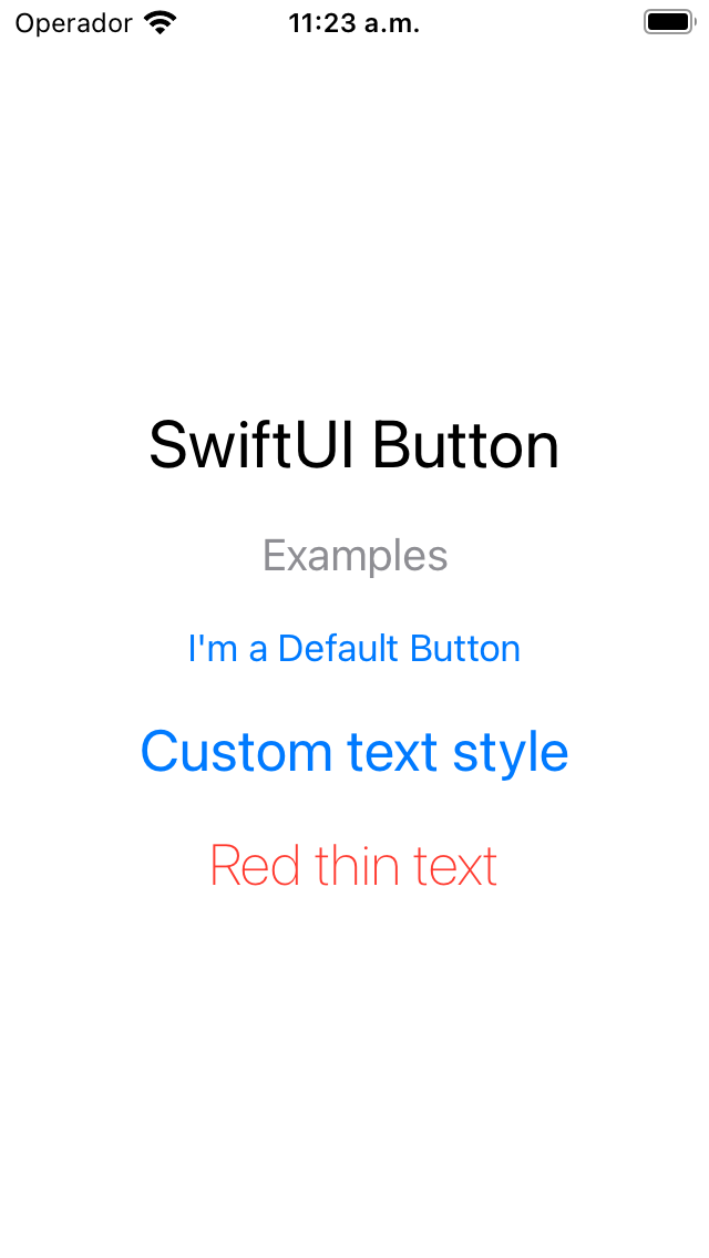
Default SwiftUI Button and Custom Text
You use buttons for any user interface element that starts an action. So probably the first question to answer is How to Create a Button in SwiftUI?. SwiftUI buttons can be created easily by providing an action and a text. The SwiftUI button action is a method that does something when a user taps on the button.
The following SwiftUI button example shows how we can customize the button's text. Note that we should use a different button's initializer to customize the button's text style.
CODE: https://gist.github.com/devs-rootstrap/0c452efdd1b798392071f588f0a71edb.js?file=button-intro.swift
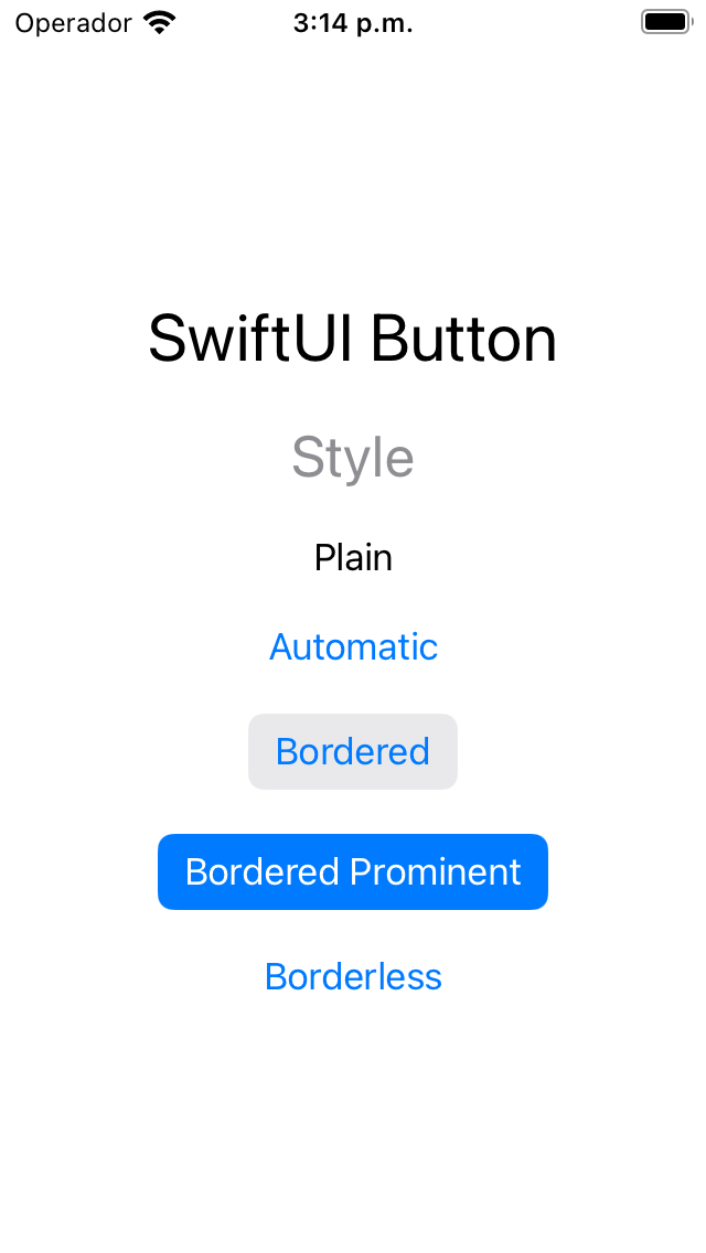
SwiftUI Button Style
You can use SwiftUI Button Styles to quickly apply a set of predefined visual attributes to your buttons. SwiftUI Button Styles allow you to maintain consistency in the appearance of your buttons throughout your app without manually adjusting each button.
SwiftUI provides several built-in button styles that you can use, including default, borderless or plain. Additionally, you can create your own custom button styles to match the design of your app.
To apply a SwiftUI Button Style, you can use the buttonStyle() modifier.
Let's look at some examples:
CODE: https://gist.github.com/devs-rootstrap/0c452efdd1b798392071f588f0a71edb.js?file=button-style.swift
SwiftUI Button Background Color
In addition to customizing a SwiftUI button label with a custom text, you can modify the button's background. Adjusting the background allows you to create SwiftUI buttons that fit seamlessly into your app's design and provide a visually engaging user experience.
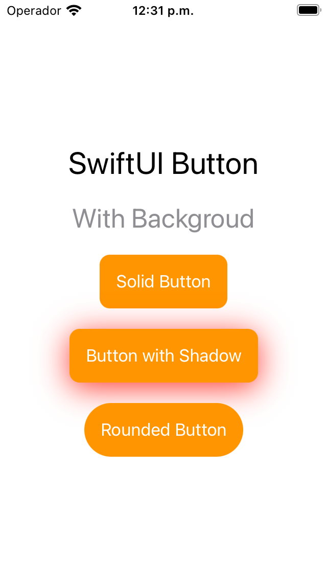
SwiftUI provides various ways to customize the button background. You can use the background() modifier to apply a solid color or a gradient. Additionally, you can adjust the opacity and corner radius of the background to customize the button's appearance further.
CODE: https://gist.github.com/devs-rootstrap/0c452efdd1b798392071f588f0a71edb.js?file=button-background.swift
SwiftUI Button Disabled
You can disable SwiftUI Buttons to prevent users from interacting with them when certain conditions are met. Disabling buttons are a useful way to provide feedback to the user and prevent them from performing actions that are not currently available.
To disable a SwiftUI button, use the disabled() modifier and pass in a Boolean value. When the Boolean value is true, the button will be disabled, and the user will not be able to interact with it. When the Boolean value is false, the button will be enabled, and the user can interact with it as normal.
When a button is disabled, its appearance can also be customized to indicate to the user that it is not currently available. By default, disabled buttons are grayed out, and the text color is changed to show that the button is disabled.
You can also customize the appearance of a disabled button by applying additional modifiers to the button, such as adjusting its opacity or changing its background color.

CODE: https://gist.github.com/devs-rootstrap/0c452efdd1b798392071f588f0a71edb.js?file=button-disabled.swift
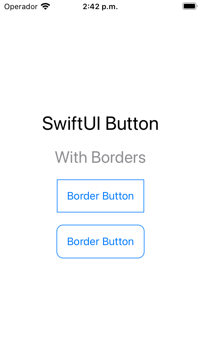
SwiftUI Button With Borders
In addition to customizing the text and background of a SwiftUI button, you can also add borders to create a more defined and visually appealing button.
SwiftUI provides various ways to customize the borders of a button. You can use the border() modifier to apply a border to the button background or the text.
Additionally, you can adjust the border's thickness, color, and corner radius to customize the button's appearance further.
CODE: https://gist.github.com/devs-rootstrap/0c452efdd1b798392071f588f0a71edb.js?file=button-border.swift
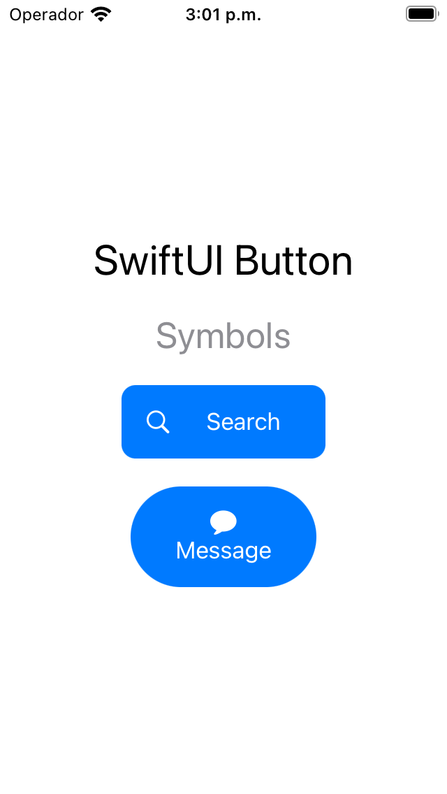
SwiftUI Button With Image (Symbols)
In SwiftUI, you can use SF Symbols to add icons and symbols to your buttons. SF Symbols is a library of over 3,000 icons and symbols designed specifically for Apple platforms.
By incorporating SF Symbols into your SwiftUI buttons, you can provide a more intuitive and visually engaging user experience.
Let's see some examples of using SF Symbols in your SwiftUI buttons. Additionally, you can customize the symbol's size and color to enhance the button's appearance further.
CODE: https://gist.github.com/devs-rootstrap/0c452efdd1b798392071f588f0a71edb.js?file=button-symbols.swift
SwiftUI Button Control Size
The control size refers to the size of the button and its text and can be adjusted to accommodate different screen sizes and user preferences.
SwiftUI provides several built-in control sizes that you can use, including mini, small, regular, and large.
To adjust the control size of a SwiftUI button, you can use the controlSize() modifier.
Let's look at some examples:

CODE: https://gist.github.com/devs-rootstrap/0c452efdd1b798392071f588f0a71edb.js?file=button-control-size.swift
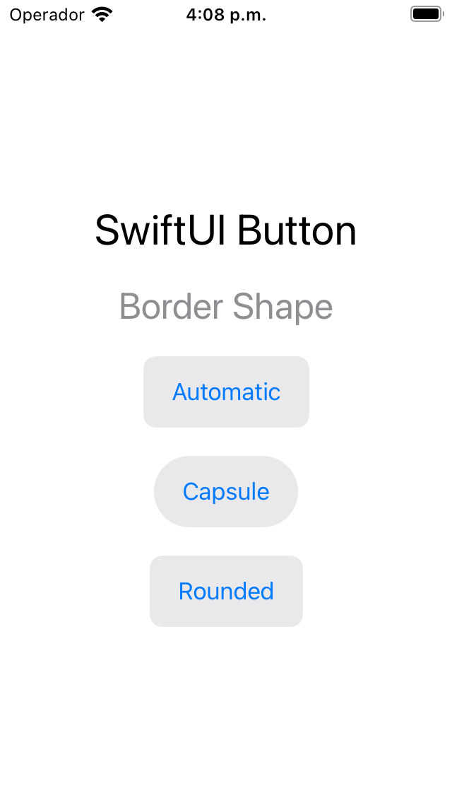
SwiftUI Button Border Shape
The SwiftUI Button Border Shape refers to the shape of the button's border, which can be adjusted to create different visual effects.
SwiftUI provides several built-in border shapes that you can use, including capsule, automatic, and rounded.
To adjust the border shape of a SwiftUI button, you can use the buttonStyle() modifier with a custom button style that specifies the desired border shape.
CODE: https://gist.github.com/devs-rootstrap/0c452efdd1b798392071f588f0a71edb.js?file=button-border-shape.swift
The takeaway
SwiftUI provides a powerful and flexible way to create buttons in your iOS, macOS, watchOS, and tvOS apps. With its declarative syntax and intuitive modifiers, you can easily customize the appearance and behavior of your buttons to match the design and functionality of your app.
In this guide, we've covered several important aspects of creating buttons in SwiftUI, including customizing the button's text, background, borders, control size, and disabled state. We've also explored how to use SF Symbols and button styles to create visually appealing and accessible buttons.
When creating buttons in your app, it's important to consider your app's overall design and functionality, as well as the accessibility needs of your users. By following best practices and guidelines for button design and behavior, you can create a more user-friendly and accessible app.
Overall, SwiftUI provides a powerful and intuitive way to create buttons in your app, allowing you to create unique and visually appealing designs that enhance the user experience.


