
A SwiftUI Picker is a fundamental component of any user interface, as It allows users to interact with an app by selecting a single value from a set of values.
SwiftUI Picker provides a variety of styles and customization options to fit the design of your app.
This tutorial will dive into the different types of SwiftUI Picker, as well as we’ll answer the following questions: How To Create a Picker in SwiftUI? and How to Customize a SwiftUI Picker?
-> Check our SwiftUI Button Tutorial
-> Check our SwiftUI List Tutorial
-> Check our SwiftUI GeometryReader Tutorial
Creating Your First SwiftUI Picker
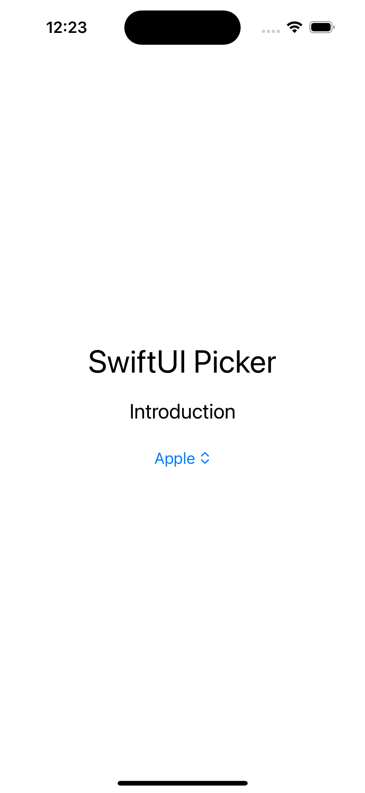
You use SwiftUI Pickers for any user interface that shows multiple options, so the user can select a single value. So probably the first question to answer is How to Create a Picker in SwiftUI?. A SwiftUI Picker can be easily created by providing a variable and text values.
To get or set a value for the Picker, you need to bind it to a variable. Then this variable is passed into the Picker, and then we can use the variable’s value to select the row that we want to show in the Picker.
One important thing to remember, is that the variable favoriteFruit, is actually bound to the Picker row’s tag property, as you can see in the following example.
Default SwiftUI Picker
CODE: https://gist.github.com/devs-rootstrap/0e59cb72b60ad811fdf2dd8ebd271d08.js?file=swiftui_picker_intro.swift
SwiftUI Picker Style
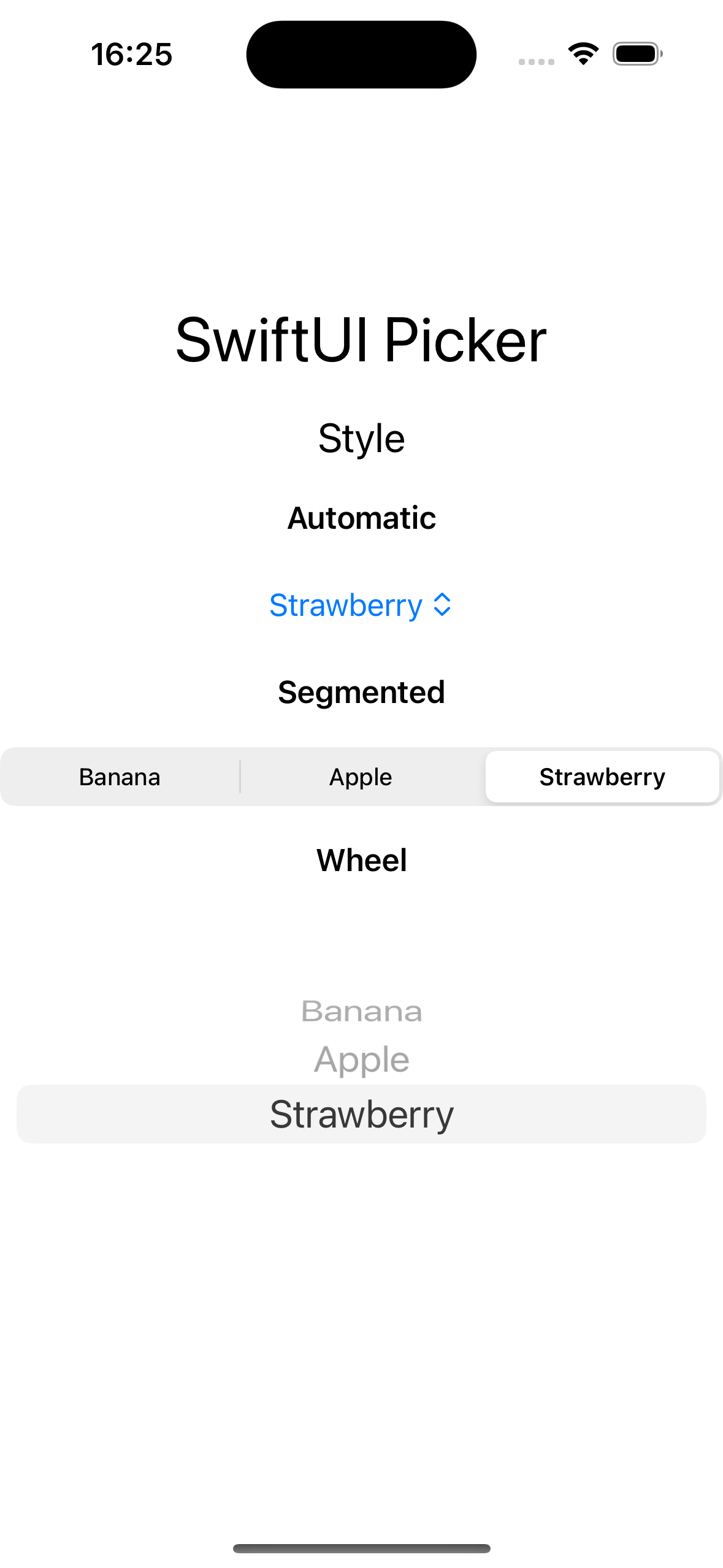
You can use SwiftUI Picker Styles to quickly apply a set of predefined visual attributes to your Picker. SwiftUI Picker Styles allow you to maintain consistency in the appearance of your Pickers throughout your app without manually adjusting each Picker.
SwiftUI provides several built-in Picker styles that you can use, including wheel, menu or segment. Additionally, you can create your own custom Picker styles to match the design of your app.
To apply a SwiftUI Picker Style, you can use the pickerStyle() modifier. Let's look at some examples:
SwiftUI Picker Style
CODE: https://gist.github.com/devs-rootstrap/0e59cb72b60ad811fdf2dd8ebd271d08.js?file=swiftui_picker_style.swift
SwiftUI Picker Navigation Link Style
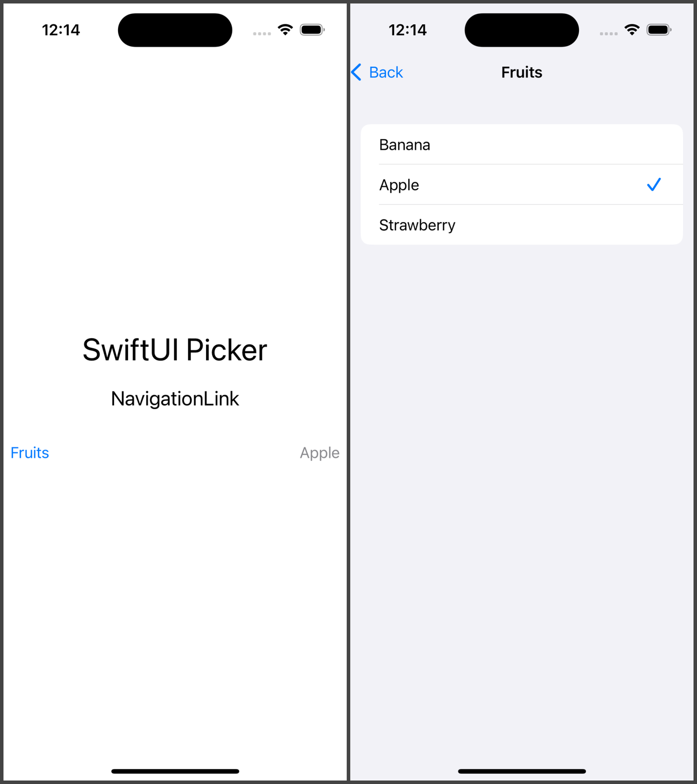
If for some reason you need to present a new screen for the user selection, you can use NavigationLink style.
One important thing to remember is that this Picker Style requires a NavigationStack as the Root view, otherwise It would not work.
SwiftUI Picker Navigation Style
CODE: https://gist.github.com/devs-rootstrap/0e59cb72b60ad811fdf2dd8ebd271d08.js?file=swiftui_picker_navigation_style.swift
SwiftUI Picker Section
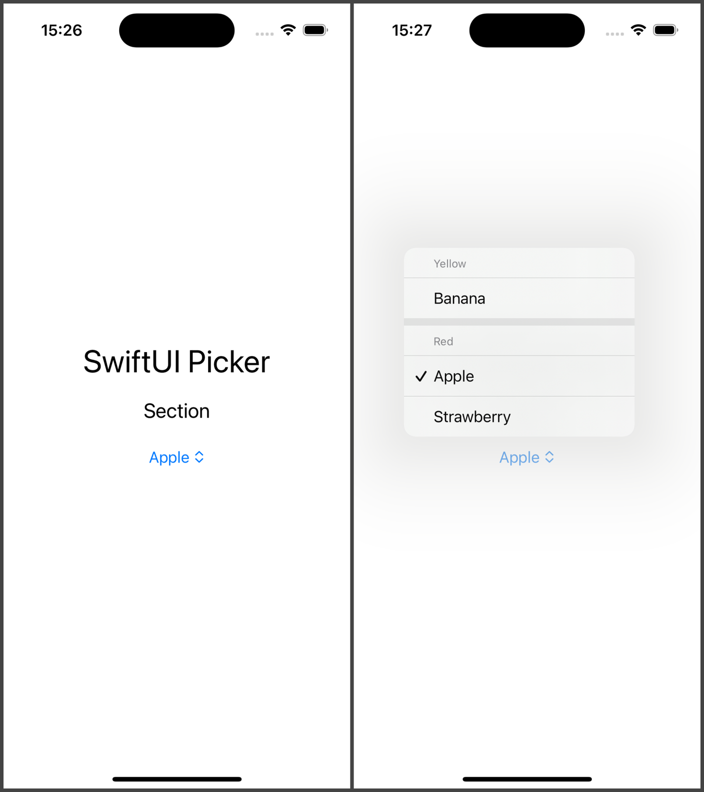
In addition to the default way to show the information, If you need to organize the information that is shown in the SwiftUI Picker, you can use Sections.
As you can see in the following example, we organize our favorite fruits by color using one section for each color.
SwiftUI Picker Section
CODE: https://gist.github.com/devs-rootstrap/0e59cb72b60ad811fdf2dd8ebd271d08.js?file=swiftui_picker_section.swift
Customized SwiftUI Picker Style
You can always elevate your app's aesthetics, for example you can modify the picker's background. Adjusting the background allows you to create SwiftUI Pickers that fit seamlessly into your app's design and provide a visually engaging user experience.
In the following examples we can see How To Customize The SwiftUI Picker Style. In our first example, we set a custom background color, and then in the following example, we set a bordered style.
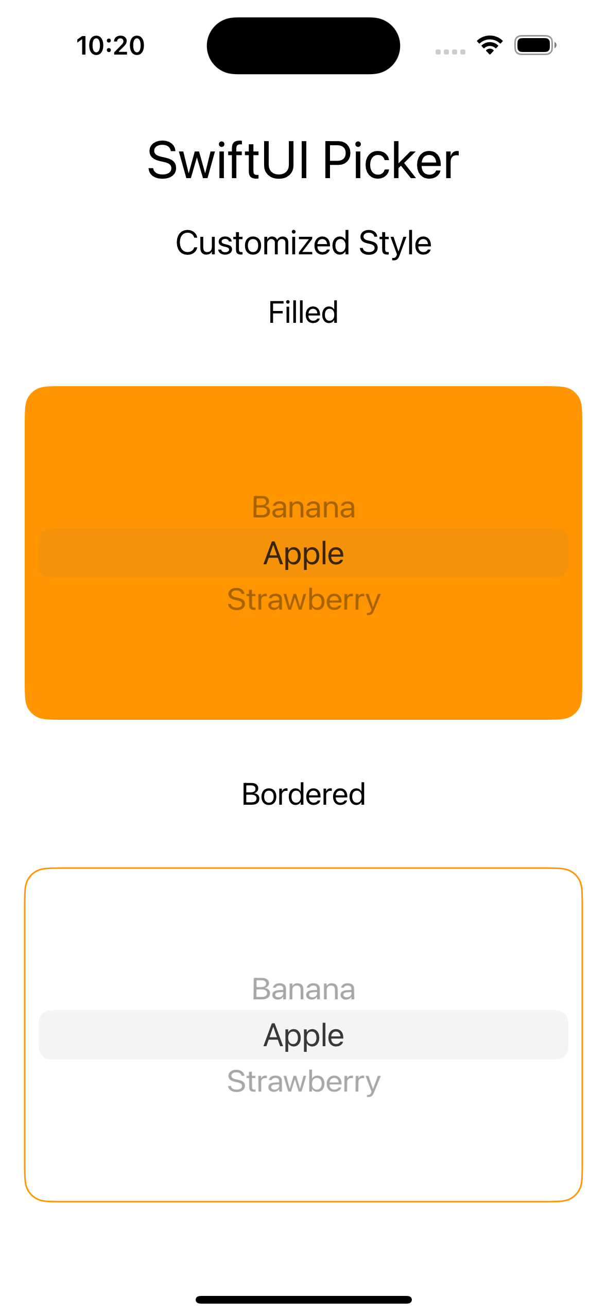
Customized SwiftUI Picker
CODE: https://gist.github.com/devs-rootstrap/0e59cb72b60ad811fdf2dd8ebd271d08.js?file=swiftui_picker_custom_style.swift
The takeaway
SwiftUI provides a powerful and flexible way to create pickers in your apps. With its declarative syntax and intuitive modifiers, you can easily customize the appearance and behavior of your interface to match the design and functionality of your app.
When creating pickers in your app, it's important to consider your app's overall design and functionality, as well as the accessibility needs of your users. By following best practices and guidelines for Picker design and behavior, you can create a more user-friendly and accessible apps.


