
Naming plays a crucial role in creating and sharing things. Why? Because eventually, we will share them with others, and ideally, others will use the things we name.
To ensure a smooth process, it's essential to establish some ground rules for naming our things (components).
This article aims to share best practices for designers to work effectively while seamlessly connecting with the development world.
Why Is Naming So Important?
Establishes Folder Structure
When exporting or consuming our library, proper naming conventions are key to folder structure and ensuring easy access to components. We can achieve significant benefits by prioritizing user experience in our naming conventions.
Reduces Complexity
Intuitive naming that uses common words and follows clear patterns of repetition and consistency simplifies the design system’s consumption. This approach requires significantly less mental effort.
Hiding Elements
When using the library, you can hide elements by using a period (".") or underscore ("_") at the beginning of the component name.
Personally, I use ".🔒master" since it provides a clear visual cue with the emoji and word, indicating that this is a master component and should be modified with caution.
Page Structure
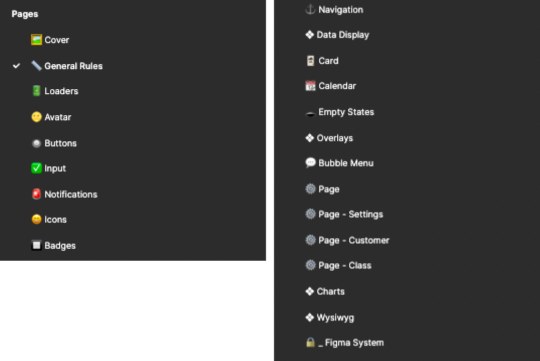
Page structure
If you have a small project, you might not be interested in creating multiple pages. However, I highly recommend doing so. Even if it's small, you will end up with granular data, space, and a comfortable zone for documenting each component later without cluttering the general view.
Organize Components Based on Groups
Grouping components
Proper organization is just as important as naming components correctly. To do this effectively, you need a general overview of what you're creating and determine if it has any parent groupings or sibling elements.
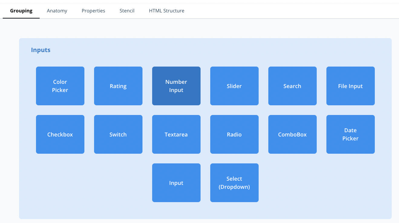
For example, if you're creating a Switch component, understand that it belongs to the Inputs category. This category includes other essential elements such as Input, Checkbox, Radio, and more.
Therefore, it's vital to comprehend these relationships and use categories that make sense for the programming community as a whole.
System Components
Often, you'll create custom components to document other components, such as notes, status labels, arrows (although the flexible arrow in FigJam is a viable alternative), or any other component that enhances the product environment.

Figma System
🔒 _ Figma System
If you frequently use similar documentation mechanisms, it makes sense to separate them into their own file and export them as a separate library for use in documenting projects.
If this doesn’t apply to your case, you can dedicate a tab in your project for documentation. As shown in the example below, add emojis to reinforce that these components are not part of the general Design System.
Naming Components
Remember that we are describing an element, not its function. The elements we are generating are templates and repeatable, which are agnostic of their context (at least up to a certain point).
For instance, when we create a search component, it is simply a Search, not a User Search Component, unless it has unique characteristics such as avatars or other UI elements that make it necessary to build a separate version from the standard Search.
All of our decisions have an impact on the development side, so it's crucial that we keep that in mind. As we analyze and understand the complexity of the product, we identify patterns and create components that prevent us from repeating ourselves and making errors.
This process mirrors what programmers do when creating components, whether it's in JavaScript, React, or any other language. The key is to find patterns and reuse elements. Therefore, how we name, group, think, and act significantly impacts development.
As a designer, we are responsible for building the code, organizing, and bringing a sense of order to the chaos of a startup product, large enterprise, or any project we work on. We are building CODE here!!
Naming Rules
Below are the top 3 things to consider when naming components and their associated ecosystem. Each of these will be detailed further down.
(1) Use uppercase for at least the first letter of your component name.
(a) Separate the name with a hyphen (-).
(2) Use (__) to define variants.
(3) Group by element with a forward slash (/).
(a) Add spaces between element names.
(b) Different ways of Grouping
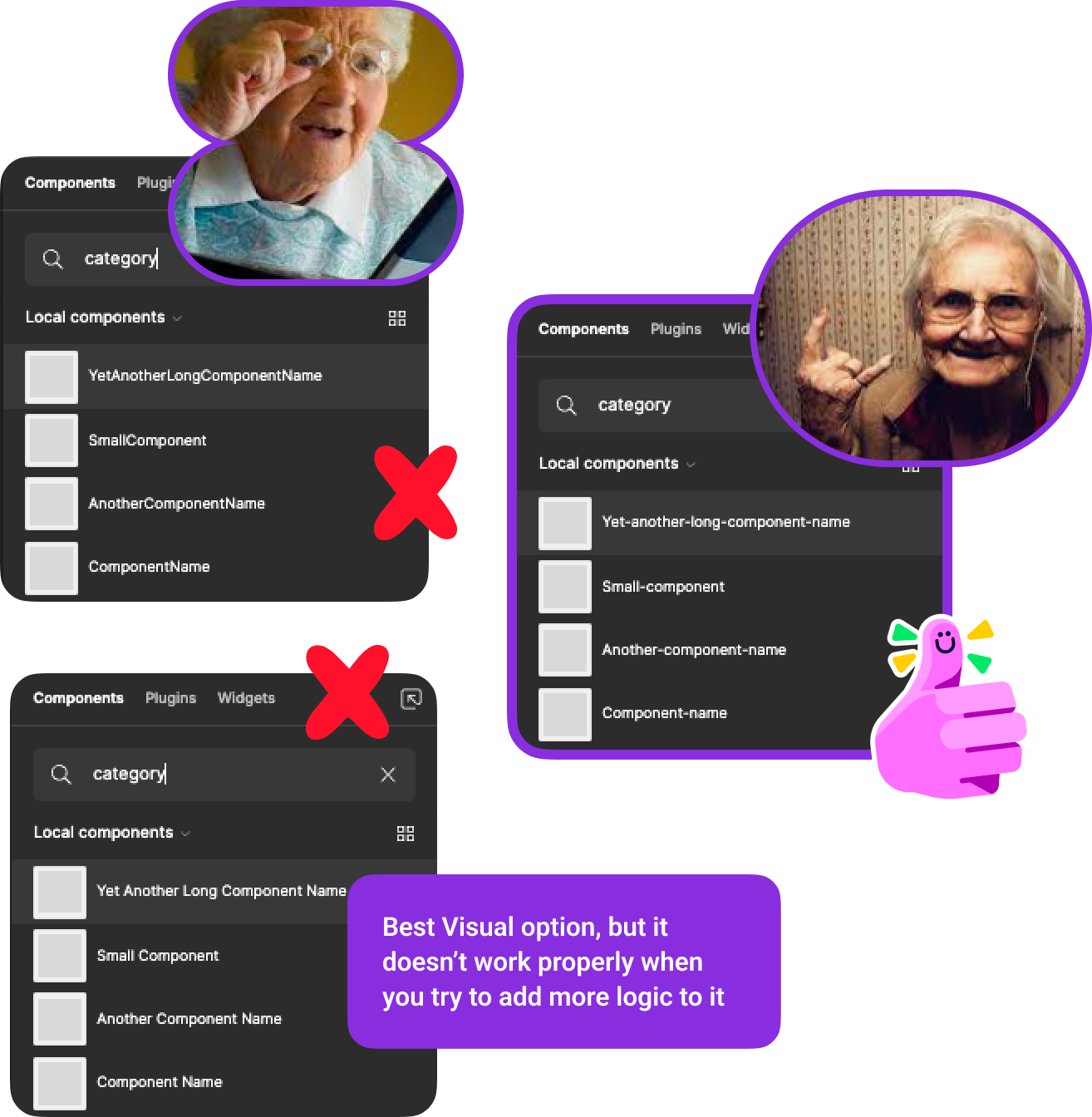
As much as I would love to mimic the coding world by naming variables and components, some sacrifices are necessary to improve readability and usability within Figma.
Decisions such as adding spaces between folders and capitalizing the first letter of each component are intended to make it easier to search for components and sub-elements.
1 - Use uppercase for at least the first letter & separate with a hyphen (-)
Using uppercases and hyphens
Using capital letters as visual anchor points makes your components become much easier to read. However, adding spaces between words is obviously the best solution for basic naming, but it sacrifices structure.
This becomes problematic when trying to define how to structure sub-elements, folders, or complex elements, causing the system to crumble.
That's why starting with an initial capital letter, and if the name of the element consists of multiple words, separate them with a hyphen (-).
2 - Use (__) to define variants
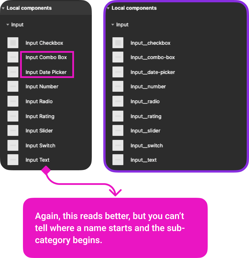
Define variants with (__)
The upper portion of this document will start making sense now. Besides adding a simple name to our components, we will also need to define dependencies, sub-components, and possibly even states.
The system we are using is based on BEM, a naming convention commonly used in programming environments.
If your project is small, you may have a page with all your inputs named "Input," or you may have them all together with the rest of your components. Regardless of your situation, you will probably have different types of inputs.
That is why we use the double underscore (__) to define variants of the same element.
3 - Group by element with a forward slash (/)
Grouping elements with forward slash (/)
Imagine having a modal component, a wrapper containing different types of content, or a Card component. Both require other components inside, so keeping everything tidy and organized is important for easy access.
If the card component is used on a specific page, you can name the inner content simply as "Content, and use a structure like the one shown in the image above. This means that all inner components will be named "Content / The-content-name."
However, if the card component is within another grouping, such as Data Display, the structure might look like this: Data Display / Card / Content / Content-name
Check the Spacing
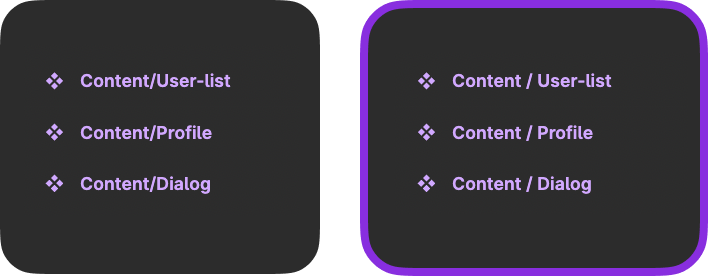
Check your spacing
It may sound silly, but notice the spaces between words and "/" as this greatly improves the visibility of the components and makes them easier to read. Figma won't have any issues with this, and it will still generate folders in the assets tree, giving you the best of both worlds.
Different Ways of Grouping
You can create a page for the high lvl, but what happens after?
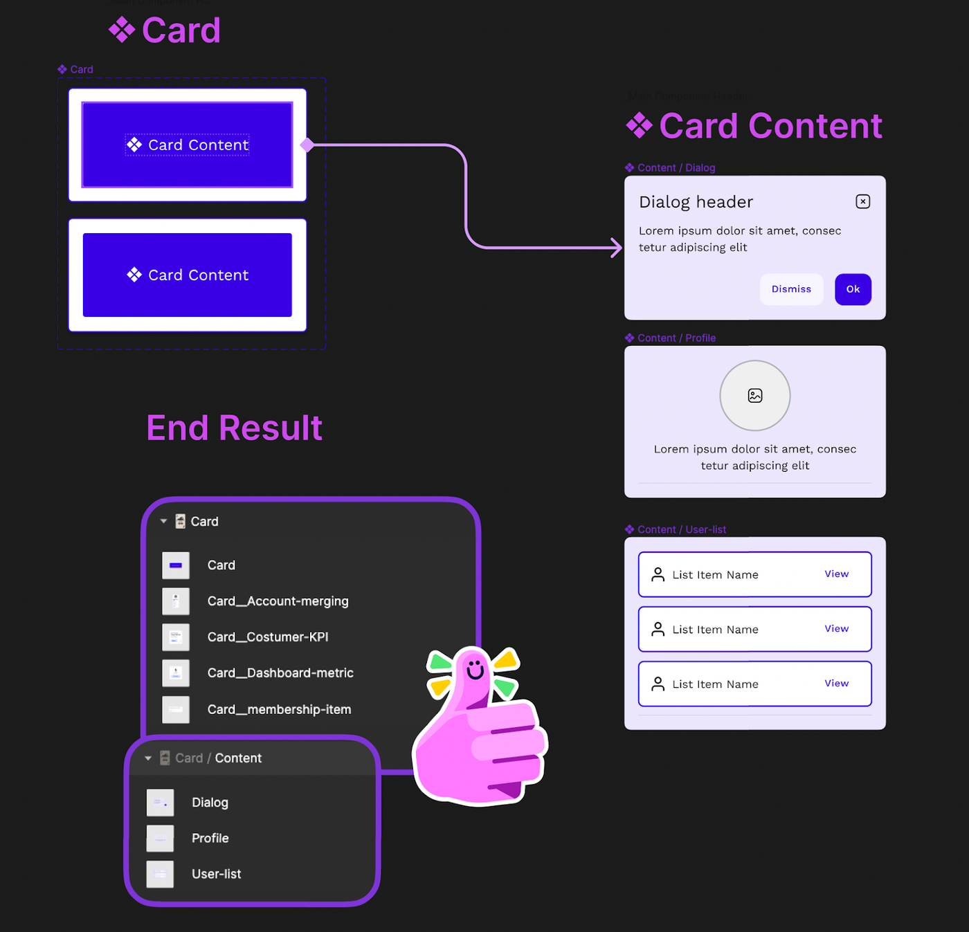
Imagine you have a high-level page named 🃏 Card. Inside this page, you have different types of cards, each containing different types of content. How would you name these Card Content items?
There are two ways that produce the same result, with different efforts and mechanics.
Two grouping options
1 - Group by Name
Example: Card / Card, and Card / Content
Not really recommended if you can use option 2 since you’re wasting a lot of characters and space from the name.
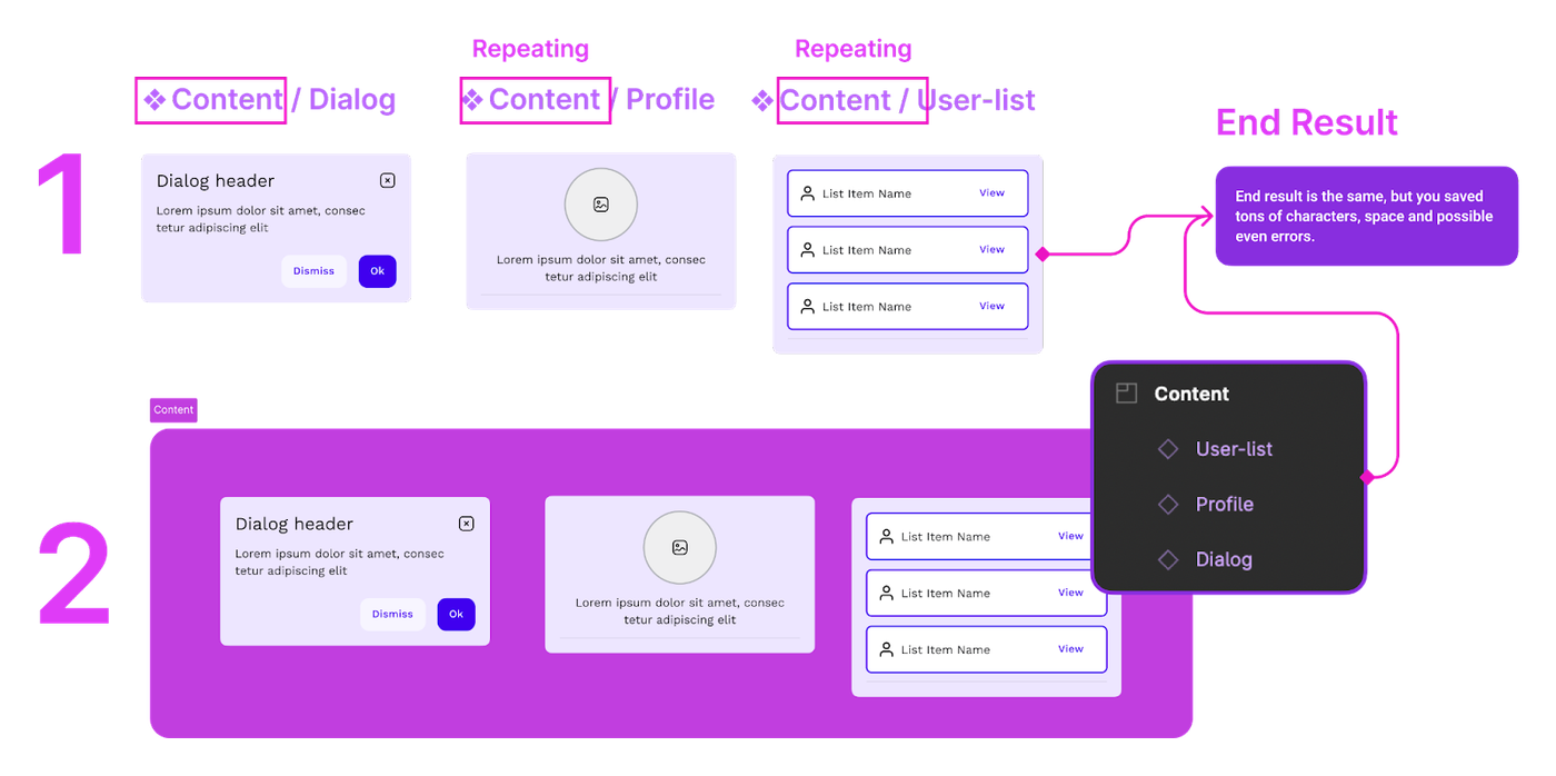
2 - Group by Section
Group by section
By grouping all the elements of the Card Content together under the same section, you can easily access and collapse them. This also generates the scaffolding you need since all your elements inside will already have the prefix of the section name.
For example, you could name your section "Content" and then have another section for "Accordion," "Calendar," and so on (if your card component is part of a higher category like "Data Display").
Ultimately, as your system grows larger, it is up to you to decide how to keep drilling down. This means that if you created a section for a set of components, but there is also a sub-set inside, you can choose to repeat the process of creating another section or take a similar naming-folder approach.
For example, let's say you created a section called "Overlays." Within this section, you have a Modal component and a bunch of Modal-content sub-components. Since the Modal is a single element, you could group it based on its name and simply name this component "Modal."
Then, within the Overlays section, you could create another section named "Modal-content" to store all the inner components. You can name these components after their content, such as "Sign-out." Figma will produce the following path outcome: Modal-content / Sign-out.
What to take away
Proper naming conventions can reduce complexity, give folder structure, and make it easier to hide elements. This article also covers page structure, organizing based on groups, and system components.
The naming rules include using uppercase for the first letter, separating with a hyphen, using (__) to define variants, and grouping by element with a forward slash.
By following these rules, you can create a clean, easy-to-access set of components that can be used within the same file or exported to share with others.
Whether you follow these underlying rules or any others you prefer, try to find your own workflow, identify your specific needs, and, most importantly, define your system.
Creating these rules will give youfaster communication with developers, reduced adoption complexity, simplified naming decisions, and faster usage of components.
What are your thoughts? Let us know in the comments!


