
ReactJS (React) is a widely used JavaScript library and one of the most popular at the moment. React is used for building small pieces of user interfaces in what we know as components, you might think of it as LEGO blocks. React allows developers to use any kind of library for routing, state management, CSS and cache, making it a flexible technology. The main purpose of this tutorial is to teach you what MUI is and how to set up this powerful CSS library.
MUI
Material UI is one of the most famous collections of CSS libraries for React, and you can find the documentation in its official website MUI: The React component library you always wanted. As of the time of this tutorial, MUI is structured into three major sections:
- MUI Core
- MUI X
- MUI Toolpad
MUI Core
In this section you can find four MUI libraries for building your app (and it is not required to use all of them in a project). Here you will find most of the components that you need when building a React application.
- Material UI: contains a collection of React UI components which implement Google’s Material Design. Material UI
- JOY UI: It is a library that contains a collection of JOY UI components which are an alternative to Material Design and is maintained by MUI. Joy UI
- Base UI: is a library of React components unstyled and low-level hooks. Base UI
- MUI System: is a collection of CSS utilities for laying out React UI componentsMUI System
MUI X (Paid version)
It is a collection of advanced MUI components such as Data Grid, Date and Time Pickers, Charts and TreeView. MUI X
MUI Toolpad
Toolpad is a tool powered by MUI’s components. It is designed to create applications faster. You build apps by dragging and dropping components and connecting external data.
SETTING UP MUI
For this tutorial we’ll be using the Material UI library as it is one of the most used and known libraries from MUI and now that we already know what MUI is in the ecosystem of React, let's set up the library in a brand new React project.
Create a new React application
Let’s create a react project by using vite.
CODE: https://gist.github.com/jeisux92/a93904ea3ca7ecdc7f84153c4b4247be.js?file=new-project.bash
Naming the project
CODE: https://gist.github.com/jeisux92/a93904ea3ca7ecdc7f84153c4b4247be.js?file=give-name.bash
Select React
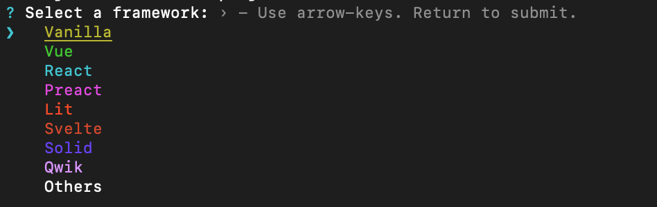
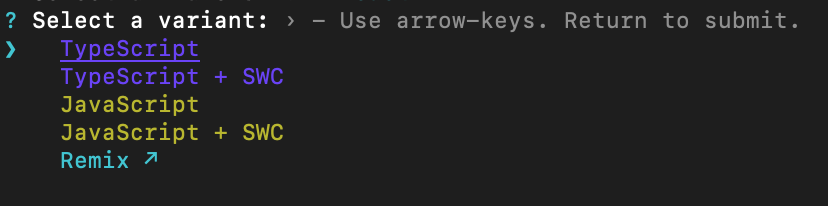
Select typescript as the programming language in which we will be writing our app.
Now run the app
CODE: https://gist.github.com/jeisux92/a93904ea3ca7ecdc7f84153c4b4247be.js?file=run-app.bash

Install Material UI
Once we have verified that our project is working as expected, let's install Material UI in it. To do so, let’s head to the official page of MUI, MUI Core and ultimately to Material UI and search for the command line instruction to install it with the default installation which comes with Emotion as its default styling engine. https://mui.com/material-ui/getting-started/installation/
CODE: https://gist.github.com/jeisux92/a93904ea3ca7ecdc7f84153c4b4247be.js?file=install-mui.bash
Install fonts (optional)
Now let’s install the Roboto font which is the default font used by Material UI.
CODE: https://gist.github.com/jeisux92/a93904ea3ca7ecdc7f84153c4b4247be.js?file=install-fonts.bash
Install Icons (optional)
To have the chance to use Material Icons we need to install an specific package
CODE: https://gist.github.com/jeisux92/a93904ea3ca7ecdc7f84153c4b4247be.js?file=install-icons.bash
Render a button
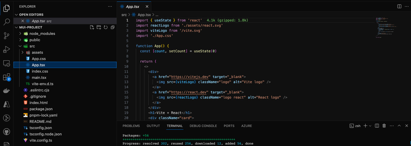
Let’s open our favorite code editor in the root of our project. You should see something similar to this.
Now, go to the App.ts file and remove all the content. Then import the Button component from Material UI.
CODE: https://gist.github.com/jeisux92/a93904ea3ca7ecdc7f84153c4b4247be.js?file=import-button.tsx
Now, Add a component called App and return the button we just imported
CODE: https://gist.github.com/jeisux92/a93904ea3ca7ecdc7f84153c4b4247be.js?file=render-button.tsx
and finally export the App component as default for our file
CODE: https://gist.github.com/jeisux92/a93904ea3ca7ecdc7f84153c4b4247be.js?file=export-app.tsx
The final result should look like this

As you can see it is really easy to get a react application up and running with Material UI, so let’s keep going.
THEMING
Having an application that stands out is crucial, necessitating customization and having a set of custom components, colors, typography and other elements that work well together and can be used in our entire application. MUI provides a good tooling to do this as we see in the next sections.
Note: if you want to explore the default theme you will find this information here Default theme viewer.
Create a custom palette color
Let’s create a new file called customTheme.ts under the src folder. Now, create a variable called theme and assign to it the result of calling createTheme. For this case we’ll use the example provided by the official documentation. Color - Material UI
CODE: https://gist.github.com/jeisux92/a93904ea3ca7ecdc7f84153c4b4247be.js?file=custom-palette.tsx
Now export the theme variable
CODE: https://gist.github.com/jeisux92/a93904ea3ca7ecdc7f84153c4b4247be.js?file=export-theme.tsx
Applying the Custom Theme
Go to the main.tsx file and let’s use the theme we just created. To do this we need to import the Material UI ThemeProvider and our theme.
CODE: https://gist.github.com/jeisux92/a93904ea3ca7ecdc7f84153c4b4247be.js?file=applying-custom-theme.tsx
Now, wrap up the app around this provider.
CODE: https://gist.github.com/jeisux92/a93904ea3ca7ecdc7f84153c4b4247be.js?file=wrap-app-with-provider.tsx
You should see now that the button’s color has changed

Using a base theme to create another one with more tweaks
Now that we have taken a first look at how to create a custom theme, let’s add more changes to our theme. Go back to the customTheme.ts file (something you need to know is that you have the chance to create a theme out of another one). It is a good idea to create a base theme with the palette color that we are going to use across our app to avoid hardcoding color values everywhere. Let’s change the theme variable name to baseTheme and create a new theme called theme out of it. The process is very similar to what we did the first time when we created the baseTheme but now, we need to include this theme as an argument to the createTheme function.
You should see something like this
CODE: https://gist.github.com/jeisux92/a93904ea3ca7ecdc7f84153c4b4247be.js?file=new-theme.tsx
Styling Components
If you want to change the styles to a specific component, that needs to be done whether when creating a theme, creating a custom component, applying the styles directly to the component or overriding the global styles.
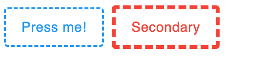
Let’s set a 45 border radius to the default MUI’s Button implementing it with the different ways to achieve this. The button should look as follows:

One-off customization
This approach is used to customize a single component or a single instance of this component, this approach can be achieved with two basic ways:
- By using the sx property which is a property available in every MUI component:
CODE: https://gist.github.com/jeisux92/a93904ea3ca7ecdc7f84153c4b4247be.js?file=sx.tsx
- By overriding the styles with class names
Create a CSS file with the needed styles
CODE: https://gist.github.com/jeisux92/a93904ea3ca7ecdc7f84153c4b4247be.js?file=css-files.scss
Import the file and use it in the App.tsx folder
CODE: https://gist.github.com/jeisux92/a93904ea3ca7ecdc7f84153c4b4247be.js?file=import-scss.tsx
- Reusable components
This approach is highly recommended as it allows for reusability and scalability by keeping a set of standard components used across the application. For this approach there are some main ways to achieve this.
- By using the createTheme function: createTheme has a property components, inside this property you will pass in all the MUI components that you want to tweak, the properties set here will be merged in with the properties from the original theme.
CODE: https://gist.github.com/jeisux92/a93904ea3ca7ecdc7f84153c4b4247be.js?file=reusable-components.tsx
- By using the styled function which receives as an argument the MUI component to be customized and returns a new component.
CODE: https://gist.github.com/jeisux92/a93904ea3ca7ecdc7f84153c4b4247be.js?file=styled.tsx
This new component could be exported as a stand-alone component from its own file;create a new file called StyledButton.tsx and paste the following code:
CODE: https://gist.github.com/jeisux92/a93904ea3ca7ecdc7f84153c4b4247be.js?file=export-component.tsx
Now import it in the App component
CODE: https://gist.github.com/jeisux92/a93904ea3ca7ecdc7f84153c4b4247be.js?file=import-new-components.tsx
Variants
Variants are a way of customizing the appearance and behavior of Material UI components, MUI has a set of built-in variants. Let’s take as an example the button component and the variants that come by default.

Creating a new variant
If you want to create a new variant to be used across our app, the way to do so is overriding the default set of variants and including the new ones by using module augmentation. Let’s do it for a Button component.
In the customTheme.ts file at the fop of the file below the imports paste
CODE: https://gist.github.com/jeisux92/a93904ea3ca7ecdc7f84153c4b4247be.js?file=variants.tsx
With this code, it is now possible to customize and use this new variant,
Now with the createTheme function let’s pass in the component property along with the new variant:
CODE: https://gist.github.com/jeisux92/a93904ea3ca7ecdc7f84153c4b4247be.js?file=use-variants-with-theme.tsx
Now use the new variant in the App.tsx file
CODE: https://gist.github.com/jeisux92/a93904ea3ca7ecdc7f84153c4b4247be.js?file=use-variant.tsx
You should see something like this:
This is it for now! And I hope this tutorial helped you understand the way MUI works and how you can set it up.
For further information
How to customize - Material UI (mui.com)
Themed components - Material UI (mui.com)


