
This intends to be a mix of smart decision and pro tips to use properties and structure components being as efficient as possible with the features we get from Figma.
- Mid to Advanced Users.
While it’s tempting to jump right into it, let’s first provide a quick overview of properties and when to use them.
What are Properties
Component properties assign names and values to elements that can be customized in a component. If we go closer with what the programming definition says, it would be around: A property is a member that provides a flexible mechanism to read, write, or compute the value of a private field.
And basically this is what we are doing, we are providing flexibility to a component by adding properties, so we can easily change/write values on it.
Types of properties
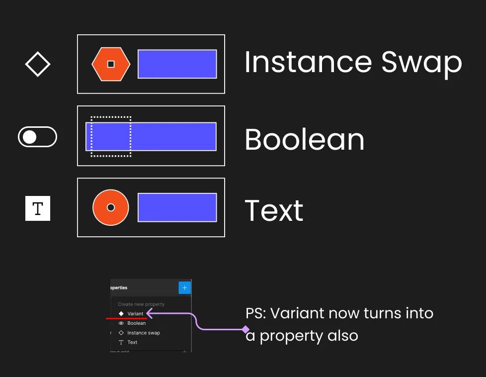
Different Types of Properties
I won’t go into details assuming that you have some basic knowledge about properties. However, refreshing our faces with Figma holy water, we have the following:
- Instance Swap: This allows you to select an instance that can be swapped with others when necessary.
- Boolean: My favorite property, these are time savers 😛. You can choose a layer, instance, or a set of them and attach a value of “yes” or “no”. In the end, this value determines whether they are shown or not.
- Text: To be honest, I don’t use this much. I find it much easier, at least for designers, to change text from within Figma instead of the properties. However, I do see value for those who are not so familiar with Figma. You define a text, assign a text property, and then you can change the text value from the properties.
Benefits of using these
- Smarter, small and concise Variant Components Not gonna dig deep here either, but just rewind in your head how big your Button or Input components were before you started using properties. All the states you had and how simple actions like showing or hiding, you had to create another variant for them…. Now that I think of it.. it’s a nightmare 😛
- Helps you prevent errors in Overrides In the past if you turned a layer or something off on an instance of a component, that would become an Override, now since you’re able to assign this properties to the same layers, if someone by mistake goes and manually hides those elements, automatically Figma detects the property behind and toggle that one On or Off.
- Aligns better with code environment I dunno if you ever worked in the programming world (I did for 5 years), but when you are creating components, whether in React or other similar frameworks, you will find yourself defining properties for these elements. And the brain process is exactly the same! We are actually programming on Figma! And by doing this, we are saving time and thought to the programmers and we are creating a stronger bond with them.
****
Now the fun part!
****
Component Structure Tips
Here you have over 10 tips that have been the result of years of experience using Figma. These aren’t just random simple tips, but rather ones that have been developed through trial and error. I’ve learned from the pain of repeating mistakes and falling into the same pits over and over again, and now I hope to share the light with you. 🙂
Wait for the patterns
We may feel tempted to componentize everything, but by doing so, we lose practicality and the original concept of creating a component, which is to avoid repetition. Repetition patterns are necessary for this concept to be effective. When you feel the urge to create a component and notice that you are repeating actions, take it as an “aha” moment where your component gains a reason to live.
Instead of jumping right into creating components, start by designing. As you find patterns, adapt and improve them. Think of this process as an MVP process. It’s like trying to define all text styles before creating any screens — it’s impossible. You first need to find repetition patterns and sizes that work well, then migrate them into styles to be consumed, and even after a while, those styles might get modified due to new findings.
Define the structure
When you are sure that you need to create a component, consider the following questions:
- Does it have states / If so, which ones?
- Will it need variants / If so, which ones?
- Which Properties will I need?
Create a small documentation for the props and different states of your component, even if it’s only as reference for aid your brain 🧠 process.
Draft your Component Definition
Master component or not?
With every release, Figma seems to be moving towards a less nested element approach and is avoiding Master components altogether. I recommend using a hybrid approach and being strategic. Personally, I haven’t been using Master components for a while now due to the features and restrictions that Figma generates with variants and the “Select Matching Layers” feature.
More in depth, and reasons why go this approach, in this article.
Define Nested Elements
I have found myself in this situation thousands of times: I am almost finished with a component when I suddenly realize that some of the logic should be happening outside of it, or that the component has grown too large, or that something no longer makes sense. All of these issues are the result of forgetting to consider the structure and behavior beforehand. Let me give you an example.
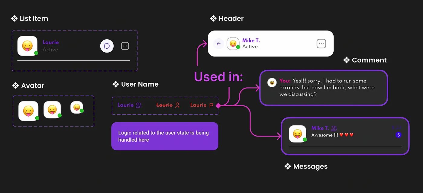
Delegate logic to corresponding components
Let’s say I’m creating an app for instant messaging, and I have a screen where I can see all my contacts. From this page, I’ll be using a List Item component that will display the other user’s name and some data. However, the user’s name, avatar, and title will appear in many other places, and their display can be affected by whether I have blocked, reported, or added the user as a friend. This means that there is logic involved in displaying the name, and we quickly realize that it doesn’t belong to the contacts “List Item” component.
A wise approach is to think about your component structure and delegate functionality to nested components. In this example, we delegate:
- Avatar sizes to the Avatar component
- User states to the User Name component
- Button states to the Circular Button component
Delegate, delegate, delegate 🙂
And then unify with Nested properties, of course 😛.
Use AutoLayout, always
There’s no structure with frames or groups that can’t be created using AutoLayout. So, lose the fear of your elements moving around when you wrap them with these little fellows. AutoLayout is your friend and it will greatly boost your work while reducing time spent on tedious tasks like changing text or moving elements around.
This topic deserves its own article. I might write in-depth about AutoLayout, including its pros, cons, and bugs.
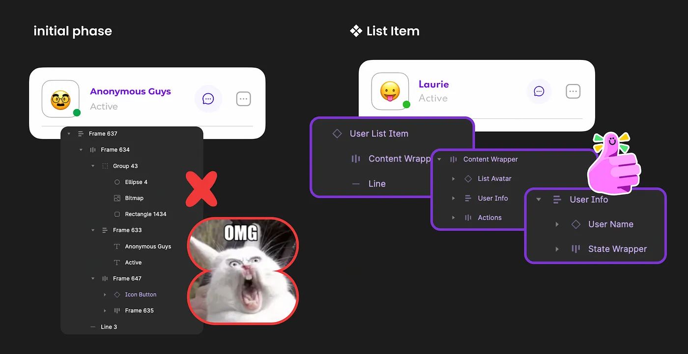
Avoid extra Wrappers
A common scenario when building a UI is to forget about folder structure and not consider how the tree will look for a specific component, page, or whatever is being built.
However, we often complicate an element’s structure by adding extra frames, groups, or even AutoLayout Frames.
There’s a useful exercise to help you improve your speed and complexity of the items you create. After finishing a component, go back and check your tree structure. Are all the frames you created necessary? Can they be simplified? You would be surprised by how much you can improve by doing this small exercise and simplifying your structure. Additionally, you gain the following benefits:
- You become smarter with your structure.
- You start thinking in building blocks, structure, and simplification.
- You become more closely aligned with the programming world, understanding how components are conceived and thought of.
- You reduce memory and file size by using less frames and structure, resulting in lighter Figma files (which is very important).
- Your creations become easier to understand.
Name your layers! 🙏🏻
Clean Naming on layers will save you!
Name all of your layers! Text layers above all. While there are many reasons for this, it’s best summed up by saying that it prevents issues with overrides, animations not working properly, and even structural errors in your component variants.
Name Nested Components It doesn’t matter that we’re instantiating other components inside — this is our new environment. That means if I bring in an icon that’s named “Icon — Arrow__Left,” I can still rename this component within my variant, and nothing will happen. In fact, it will be a success, since we’re creating a component that’s agnostic of the things you put inside. It would make more sense to name this icon something like “Icon__Left,” and then we can perform an instance swap and the name will remain the same. This prevents confusion, like having a heart icon with a wrapper named “Icon — Arrow__Left.”
More of Naming conventions in this Article.
Simplify Instance
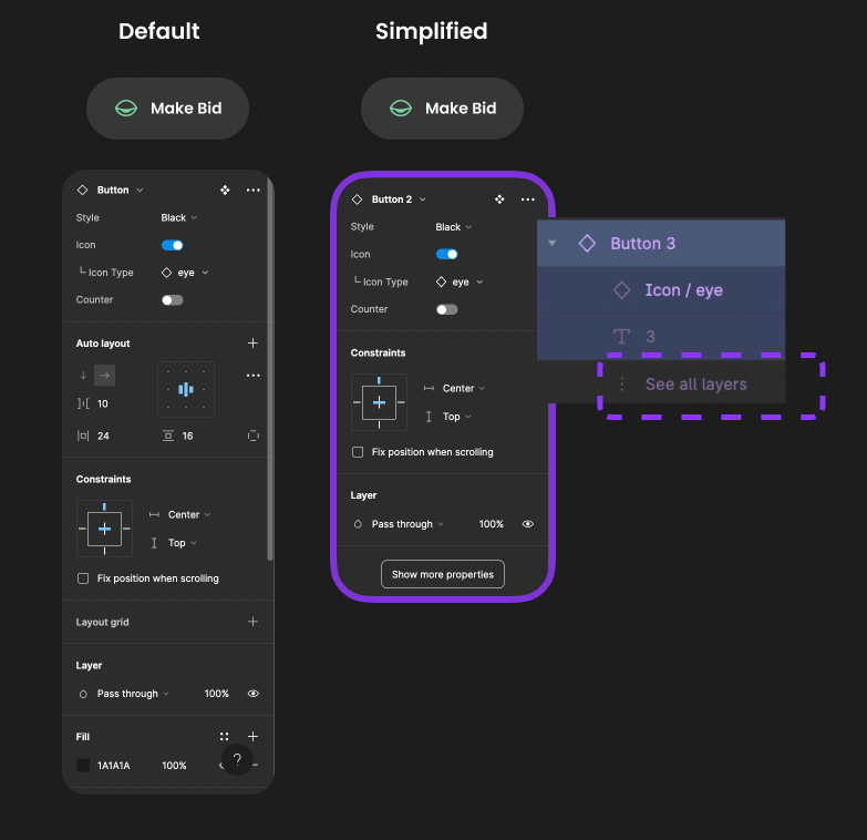
Simple is difficult
This little feature is a bit hidden, but contains a lot of power, and cleaning to your files.
Enabling this on the component configuration you simplify all the layers, and properties on your component instances, reducing a lot of noise, but at the same time implying that if you hide those, those shouldn’t be touched so lightly, there’s a reason why.
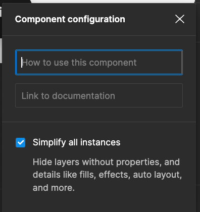
Figma UI Simplify Instances
Default Variant based on position
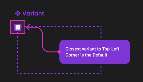
Top-left for default Variant
I also learned this one by trial and error, but did you ever wonder how you define the default variant of your component? Now that I know, it seems pretty straight forward, but caught me off-guard in my early stages.
Closest variant to the Top-Left corner of the Variant component will be the default option, yep, yep.
Make Select Similar layers your partner
I became a fan of the “Select Matching Layers” feature (⌥⌘A). This feature allows you to do the same thing as editing a master component. By selecting all of the text elements with the same name (under the same folder structure, of course), I can apply any general changes I need without leaving my main button component.
More in depth of the reasons why I no longer use master components in this Article.
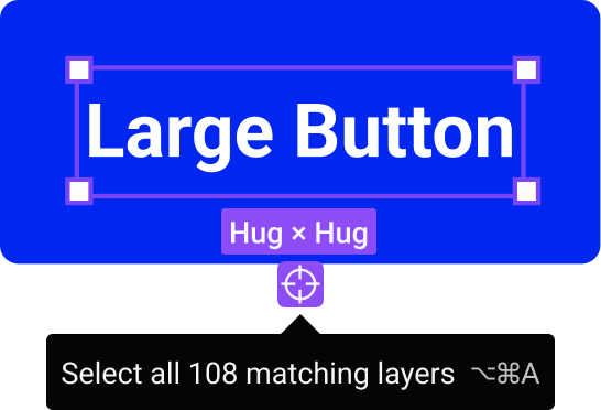
Select Matching Layers UI
Properties Tips
Remove last property

I have encountered myself many times in a scenario where I created a component with multiple variants and props, but later realized that I no longer needed them. Initially, I tried to remove the unwanted props. by clicking on the minus icon, but Figma did not allow me to remove them and did not provide any feedback.
However, it is actually quite easy to revert the component back to its previous state before it becomes a variant. Simply drag the component outside the boundaries of the variant and you will see it transform back to its original form.
It is important to note that you won’t lose any references to the other instantiated copies of the component. So, if you have already used this component as instances and then break the variant by moving the element outside, the reference will remain intact.

Preferred values
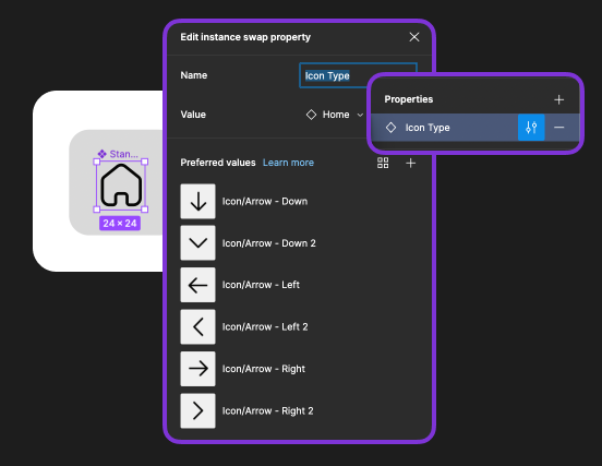
When you create an Instance Swap Property, you can define preferred values. These are options that can be preselected and pre-populated when you try to swap this instance. In other words, you have the most commonly used options readily available for faster use.
For example, let’s say you create an Icon component where you handle the color with a Union (I’ll explain this in detail in the future, but that’s for another story). Then, you create a property to swap this icon once instantiated. If you were working on a huge project with 300 icons, having to scroll through a huge list every time you pull this icon would be a hassle. Instead, you can define a few values that are likely to be the most commonly used, such as arrows, chevrons, user, settings, and so on.
Here’s an extra tip: you can select entire folders if you already have your preferred values under a named folder structure. This too will save you time in the future (see the gif below).
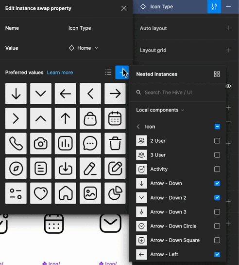
Select folders to auto-select inner elements
Multiple elements with the same boolean
This one might seem silly, and some of you probably already figured it out, but you can assign a Boolean property to more than one element, layer or component.
For example, let’s imagine you have a list item component for a user, and you define a boolean called “Special User” this will make this row item to show a badge and some actions on the right, two separated elements (see gif below).

Naming Properties Tips
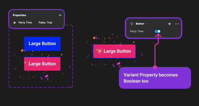
Boolean on any property type Small, but effective: Variant property can accept Boolean values. While Boolean properties exist on their own, changing the way Figma displays properties on the left panel can work to your advantage. If you only need a Yes/No value to switch between variants, use a switcher instead of a dropdown. Figma will recognize values in the form of Yes/No, On/Off, or True/False.
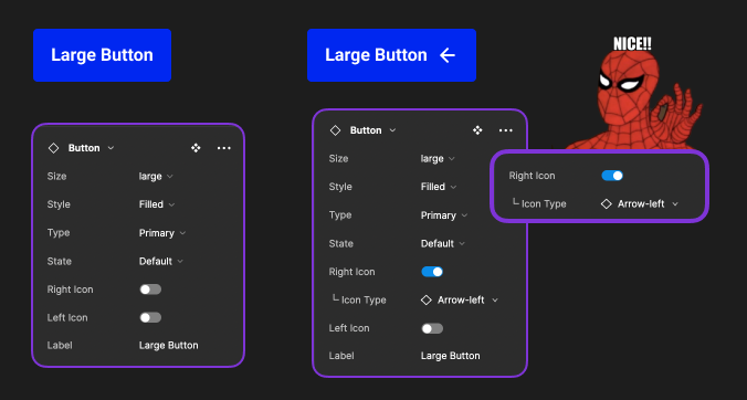
Sub properties with (└ )
Spidey-sense, hack the system
This is one of the examples I was saying earlier today, where your spidey-sense can warn you about Figma not being good enough for your eyes, or Ninja skills 😂.
If Figma is already doing this connection of showing or not the properties based on if the element or parent element is visible or not, why not showing it, Figma? Why??
But hey, we can easy fix this by adding (└ ), or any other visual aid you feel comfortable with and serves to determine that B property is attached to conditional form A.
Also, btw you need to play re-organizing your properties in the tree, otherwise you won’t see these properties next to each other, simply drag and drop them while standing on the component Variant dotted-wrapper.
Be careful with your Overrides
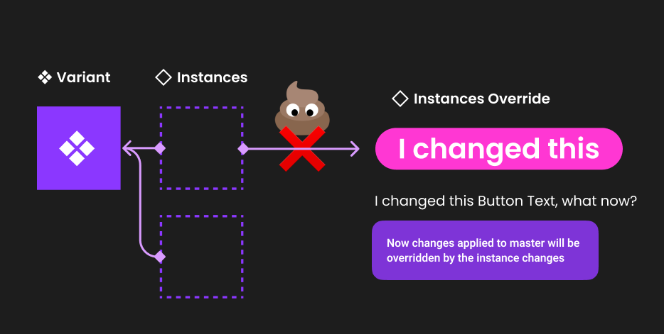
Don’t poop on your connections
First, let’s define what an override is: any change you make on an instance of a component that isn’t part of the properties you defined. In simpler terms, if you modify the text, stroke, background color, or anything else on a button component for example, those modifications become overrides to the master component.
What happens when you create an override? It means that the value you just changed will no longer receive updates from the master component. This is extremely important, so pay attention to any changes you make to your component instances.
The most common override we create is changing text on elements, for example (as shown in the image above). However, keep in mind that if you later decide to change the wording of that text element in the root component, it will no longer update for that instance because it has an override. Similar or worse scenarios can occur if you change the font weight, stroke, or other small details. If you later update the root component, those values affected will not update for those instances with overrides. Unless you perform a reset 🙂.
Advice: limit yourself to perform only text content overrides, if you feel the urge to perform other changes on an instance, that might be a good indicator that your needs have changed and probably your component needs some updates, or you need to re-evaluate your situation.
Reset Instances
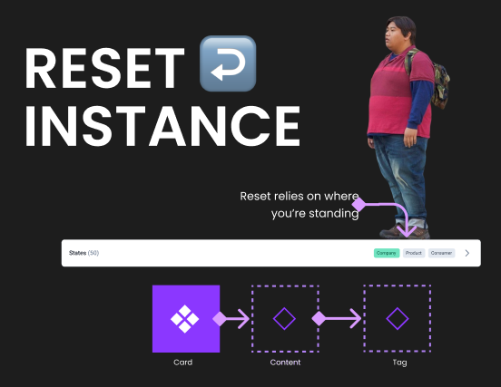
Where you stand, matters
Rule of gold: Reset depends on where you are standing!
How many times you had to reset something on a component, but they way you used to do it was by resetting the entire component? The fact is, that depending on where you are, you can reset different things.
Take the example on the image above, I have a card that has a right-content inside, and within that I have 3 tags, If I needed to reset an override that I did, for example, on the first tag 🏷 (active one) my place to stand would be on the content wrapper. And let me explain you why, there are 2 factors that alter what is gonna happen once you hit reset:
- The parent component
- The component itself
Let’s do the reasoning together: You want to reset the tag to how it was before, right? But, before where? How was it defined on your card initial composition, or how was it defined on the tag component? 😉
If I hit reset, standing on the right-content wrapper, all the tags are gonna reset to the initial state of my card component definition, but, if I reset standing on the tag itself, it will reset to the default value of the tag component. Also by drilling deeper you can select which aspects of the reset you need, for example, maybe only the text, an icon, etc.
All the above basically means: that you can perform partial resets, you don’t need to reset everything, and that also where you are standing changes the outcome of that reset.
Nested Properties
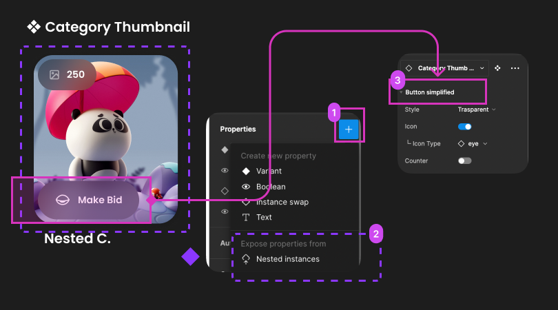
Last but not least, as spoken earlier in this article, by delegating responsibility to other nested components, you simplify and create a better component. More agnostic, of other logic happening somewhere else, and more robust and versatile, but if you delegate but don’t propagate this props to the parent, is good for nothing 😛.
And here, sorry, but I’m gonna quote again: We are programming components, as if we were Developers! Same task would be performed by a React developer, they would propagate properties for nested elements to the parent, to make them accessible at a higher lvl.
So basically, after you delegate, then you can decide which of all these properties you want to surface out to your main component. For example I might have a tag and a button inside my card, but my logic says that I’m only gonna need to change from time to time the button, not the tag, so I only expose that one out.
Summary
These are just a few tips I filtered based on impact and process boost. There are quite a few more that I might go into details in the future. But for now, this shall do 😛.
The idea was to share with you common scenarios that I’ve encountered across these years playing with Figma, and how I managed to sort out the limitations of tools, processes and even personal challenges.
The take away would be: Don’t expect or assume that the tools you use will have everything sorted out for you.
Even Figma can sometimes lack your perspective as a user of the tool, and only you will have some crucial insights on how to improve your experience and efficiency. For example, Figma does not properly arrange properties or clearly show how dependencies work between them. However, if you play smart, you can hack your way out of these and many other challenges.
Keep an open mind, trust your instincts and process, and nurture the skeptical voice inside you. Just because you use fancy tools or popular methods does not mean they will work perfectly for you. Perfection is a tough goal to achieve.
I hope you found this information useful, and I welcome any challenges to my decisions with better solutions in the near future. 👋🏻
You can find me here: Linkedin 🫶🏻


