


More and more developers are now switching to declarative programming frameworks as they can build interfaces without defining complex imperative mechanisms to change an app's state.
With the latest declarative tools at their disposal, developers need less time and code than ever to produce high-performance apps.
In response to the trend toward declarative development, Google released its Jetpack Compose toolkit in 2019. By understanding this powerful tool, developers can quickly bring their apps to life with less code, robust features, and intuitive Kotlin APIs.
This article will explain how to install Compose and introduce several essential features.
What is Android Compose and Why Use It?
Jetpack Compose is Android's modern toolkit for building native UI. Based on declarative programming, Compose simplifies and accelerates UI development for Android devices. Below, I will list a few advantages Compose compared to the previous Android development tools:
- Compose does not require that developers define their UI elements with XML files.
- Compose makes it easier to develop responsive user interfaces.
- Compose provides better support for animations and transitions.
- Compose is more efficient than the previous Android UI toolkit.
- Compose code is more readable and, thus, supports better collaboration with other developers.
Android Compose Essentials
To begin developing with Compose, we need to understand its basic architecture and how to define the following:
- Layouts
- Themes
- Fonts
- Navigation
- Lists
First, we will begin by setting up a new Compose project.
Installation
To begin a new Compose project, open Android Studio, create a new project and select Empty Compose Activity in the Project Template window. Configure the project with the settings below and add the following definitions and dependencies to your [.c-inline-code]build.gradle[.c-inline-code] file.
Add android compose to your project gradle:
With our app configured, we can now discuss how to create layout elements in Compose.
Architecture
As the Compose UI uses the declarative paradigm, we cannot alter layout elements directly as one does imperatively. Instead, a Compose UI maintains a tree of layout elements. We can change the state of an element, and Compose will redraw everything under it in the tree. To change the root layout element, you must update(redraw) every sub-element below.
Let's say you have this simple compose UI with a container with a row with some text and a button. The widget tree has the container as the parent widget and the row as the container's child. The row has two child elements: the text and the button. We can visualize this with the figure below.
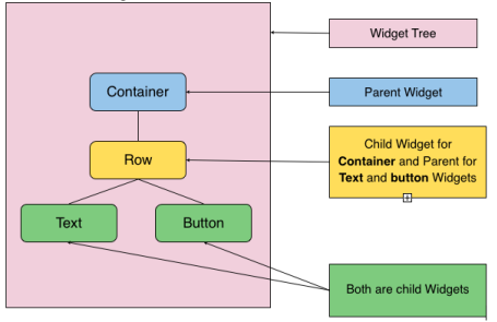
If we change the Background-color of the container, the app redraws the entire tree from scratch. Redrawing the whole tree may demand considerable resources if the tree is large. So, we need to be careful with the changes we make. However, changing the row's state will not affect the container, only the row's children(the text and the button).
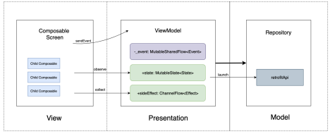
Besides the tree of layout elements, the Compose architecture is the same as the MVVM (Model View ViewModel) architecture. Only with Compose, the ViewModel updates the state and values of the layout elements in the tree, as illustrated below.
Compose Layouts
We declare layouts in Compose as functions. In the example below, we create a profile card layout with a column containing two text elements:
Note that composable functions always require the [.c-inline-code]@Composable[.c-inline-code] annotation before its definition.
Layout Types
We can divide the Compose layouts into two groups: data/interaction and containers. Data/interaction elements include image and text views, buttons, checkboxes, etc. Containers contain other layout elements and include items such as columns, rows, boxes, and constraints.
We call the elements inside containers the children of the container. As mentioned in the architecture section, if we change the container element, the app recursively redraws every child element (and their children).
We use containers to organize the views. Typically, we configure a view's properties in the container element with settings such as background, touch behavior, margin, padding, etc. Let's see an example:
Notice, in the example above, my use of modifiers. Modifiers allow you to tweak how the app presents a composable layout and how the layout behaves. With modifiers, we can accomplish the following:
- Change the composable element's behavior and appearance
- Add information (e.g., accessibility labels)
- Process user input
- Add high-level interactions (e.g., make an element clickable, scrollable, draggable, or zoomable)
Compose Theming
Now that we have created some layout elements, we can customize their appearance with theming. Compose theming using Material design 3 (Material You), Google's set of guidelines, tools, and components for Android UIs. We can model themes with classes containing specific theme values.
For instance, we can define a few colors with the code below:
Then, we can set the color in the application's theme:
Moreover, we can extend the theme by defining more specific values, like in the following code snippet:
Then, we can use the theme's values in other elements:
Also, you can define custom colors in your theme:
If you need a specific resource for the theme, you can define it as I do below with the painterResource:
Compose Defining Fonts
In Compose, we can define and use fonts by simply creating a variable for the font, a variable for the typography of a layout, and adding the ladder to the theme. I will illustrate the process in the following example, which defines the font Rubik and adds it to my theme:
Compose also allows developers to define specific themes for specific content. To learn more about custom theme configuration, see: Custom design systems in Compose - Jetpack.
Compose Navigation
Compose dramatically simplifies how we handle navigation. We no longer need to use intents, and we don't need to start a new activity or inflate fragments.
With Compose, we do not need to pay attention to an activity's lifecycle. Instead, developers can use the NavController API to handle navigation. Let's see how this works with the following example:
Compose Lists
We can create static and dynamic view lists with Compose, as with previous XML implementations. However, Compose replaces RecyclerView and ScrollViews. So, in our examples, we will demonstrate how to create static and dynamic lists with Compose's new tools.
Static Lists
Intuitively, to create a static list, one group a view next to another (or beneath another) as in the code snippet below. Here, we implemented a loop that inserts a vertical list of Text elements:
The scrollState variable retains the scroll position while the user navigates the app. When the user reaches this screen again, they will see the list in its place when they leave the view.
With the vertical scroll modifier added to our list, our code becomes:
Dynamic lists (LazyColumn / LazyRow)
Static lists perform better if we have a long list of views. For example, if we want to display hundreds of images, the app will require more memory and more time. Using the Compose equivalent of RecyclerView, LazyColumn, or LazyRow, we can create a dynamic list to display longer lists more efficiently.
As with other Compose features, LazyColumn and LazyRow are both easy to use. In the following code snippet, we will replace the Column from the previous example with a LazyColumn. Please pay attention to how we implement the items() function by indicating the number of elements we want to display:
In the LazyColumnDemo example, the app creates each item as it displays them. As the user scrolls past each element, the app erases them to save resources. If we want to store those items and recover their state, we can use the composable function remember() as in the example below:
The Compose library simplifies dynamic list creation by removing the need to create an Adapter, a ViewHolder, and XML. The LazyColumn and LazyRow elements complete all this work for us.
Conclusion
Google's Compose toolkit provides Android developers with intuitive and powerful declarative tools that improve app performance and require significantly less code.
With the examples above, you can explore the essential features of Jetpack Compose and begin developing your apps with declarative programming. For more information, check out our support material below.
Support Material
Now that we have covered the basics, I recommend exploring the information, sample apps, and resources below to further develop your understanding of Jetpack Compose.
Demo Project:
Sample apps and Documentation:


