

From Design Drift to Design Intent: Rebuilding Our Design System Boilerplate
Over the past few months, I have been refactoring the design boilerplate we use to start new projects at Rootstrap. What began as an effort to improve consistency and handoff gradually became something broader: a rethink of how much information our design files actually communicate to designers, developers, and AI tools.
The original boilerplate had served us well, but it had also accumulated some of the same problems we were seeing across active project files. We relied heavily on primitive values, much of the logic behind components lived in team knowledge, and small inconsistencies were easy to introduce without anyone noticing.
A project might need a component that was missing from the library, so someone would bring one in from another UI kit. A designer might slightly modify an instance to solve a specific layout issue, or change a color because it worked better against a particular background. Each change made sense in context, but the problem appeared later, usually during handoff.
A developer would find two similar components with slightly different border radius values, two grays that looked almost identical but used different values, or a button behaving differently from the rest of the system. There would be no obvious way to tell whether that difference was intentional. The file still looked fine, but it had stopped explaining itself.
We rebuilt Rootstrap's Figma boilerplate around semantic tokens, component contracts, and an audit workflow. The result makes design intent and accidental drift easier for designers, developers, and AI agents to identify.
When the meaning lives in people's heads
One of the biggest issues with the old structure was how directly components relied on primitive values. A variable such as neutral/600 tells you which color is being used, but not why. It could represent an input border, a divider, disabled content, or something else entirely.
For someone who has been working on the project for months, that meaning may seem obvious. For the next designer or developer opening the file, it is not. This became even more apparent when we started experimenting with AI in our design workflow. I based parts of the boilerplate on the way Tailwind CSS and shadcn/ui connect tokens, component conventions, and implementation. I use Claude Chat to inspect or audit the Figma file through either Figma's official MCP server or Figma Bridge by Southleft.
An AI agent does not have the background knowledge of the team. It does not know that a particular gray has historically meant "input border" or that a specific component property should behave differently in code. If that information is not represented somewhere in the file, the agent has to infer it.
We eventually realized that the issue was not really about AI making poor decisions. The file was asking everyone to make too many assumptions, and that became the starting point for the refactor.
Moving from values to intent
Primitive vs semantic tokens
The first major change was the variable architecture. At the foundation we still have primitives: color ramps, spacing, typography, radius, icon sizes, and other raw values. They are necessary, but they are no longer the values designers need to think about most of the time.
Above them we introduced a semantic layer. Instead of assigning something like neutral/600 directly to an input border, the component references border. Instead of choosing a particular brand color for an action every time, components can reference primary, while other semantic variables describe roles such as card, ring, and destructive.
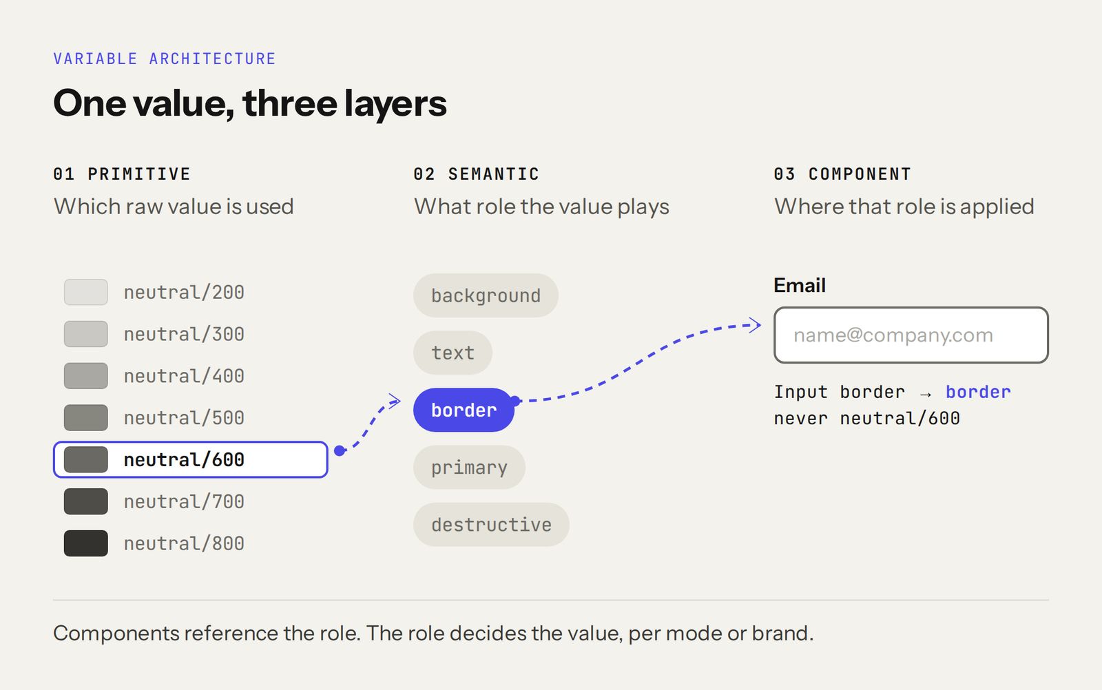
Semantic design tokens in Figma: the primitive neutral/600 is mapped to the semantic border role, which the Input component references instead of the raw value.
That sounds minor, but it changes how designers think about the system. The question is no longer "Which gray should this be?" It becomes "What role does this value have?"
It also makes light and dark modes easier to manage. The same semantic variable can resolve to a different primitive depending on the mode without changing the component itself. Rebranding becomes more predictable too, because much of the visual identity can be changed through the underlying variable architecture instead of working through components individually.
There are still cases where using a primitive directly makes sense. Exceptions are allowed. They just have to be visible and intentional, instead of blending into the rest of the file.
Making components explain themselves
Tokens solved part of the problem, but not all of it. If the file was going to be easier for developers and AI agents to understand, the components needed more context too.
We started adding clearer contracts to the component documentation. These describe not only what a component looks like in Figma, but how its properties and states should be interpreted when the design becomes code.
Mapping Figma states to code
Take an input as a simple example. In Figma we need to represent states such as hover, focus, active, disabled, and destructive, but those states do not necessarily map directly to component props. A Figma state called Focus should normally become a CSS focus state, not something like state="focus" in React.
Similarly, a destructive input is represented visually in Figma, but the implementation should communicate that through something like aria-invalid, rather than inventing a new prop because the Figma component has one.
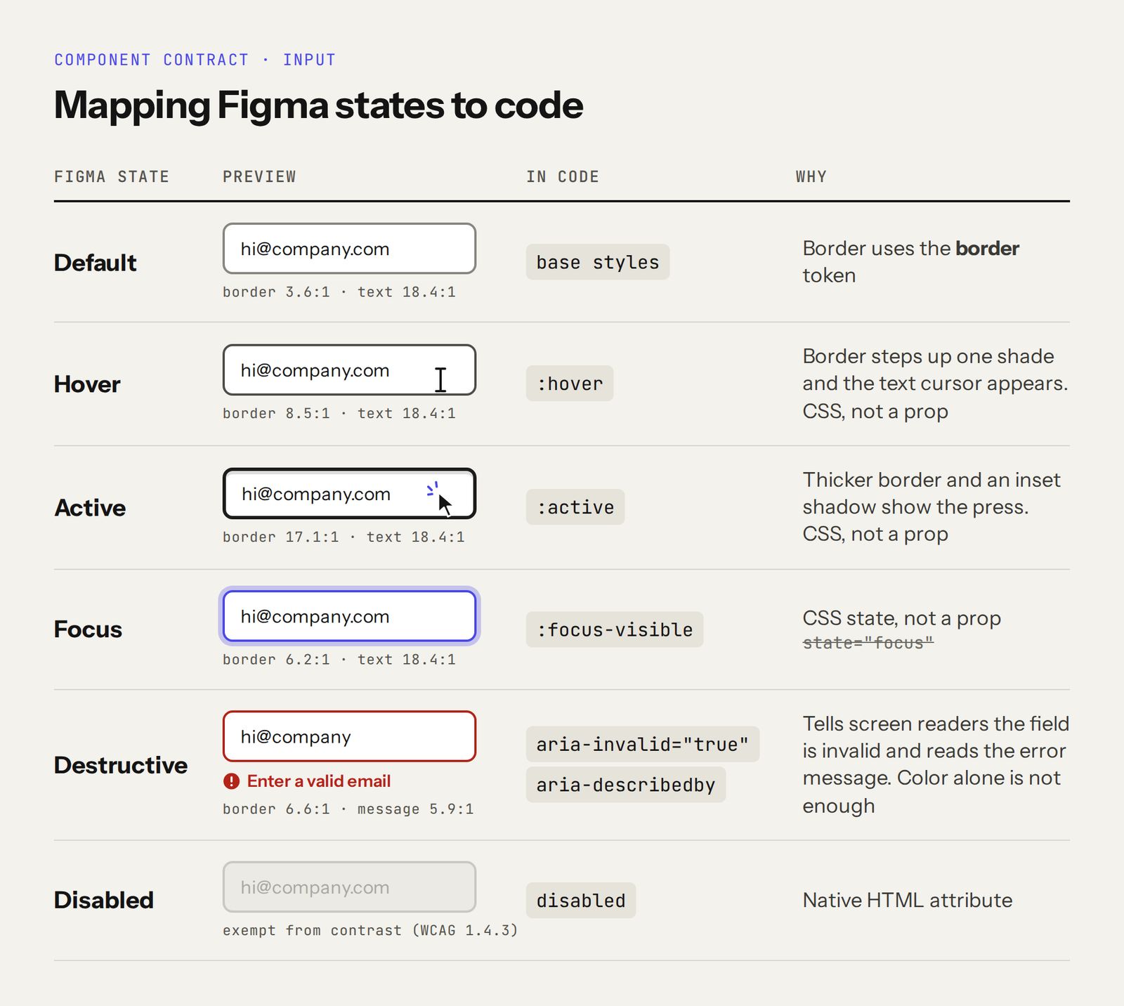
Mapping Figma states to code for an Input component: Focus to :focus-visible, Destructive to aria-invalid, Hover to :hover, Active to :active, Disabled to the disabled attribute.
Those distinctions are familiar to an experienced designer or developer, but much less obvious to an AI agent reading the system for the first time. The component documentation now explains what a component maps to in code, which Figma properties correspond to implementation props, which states belong to CSS, and where our system intentionally extends the component library underneath it.
Semantic naming gives an agent context, while the component documentation tells it what to do with that context. Together, they reduce the amount of interpretation required.
Making the system easier to audit
Another goal of the refactor was to reduce how much we rely on someone manually noticing that something has gone wrong. We had design guidelines before, but guidelines are easy to forget when a project is moving quickly, so the system needed a way to check itself.
Automated design system checks
I built a script that can inspect the boilerplate against the rules we defined for it. During the refactor, it surfaced issues that would have been difficult to catch visually, including a secondary button whose hover state had effectively become a primary button, text field properties that appeared in the Figma panel but were not changing anything, duplicated helper text patterns, and inconsistencies in focus states.
I run the lint script from my Claude account through the MCP Bridge plugin in Cloud Mode. The script travels with the template at a public raw URL and returns a read-only report in Claude Chat, so running it on a client file makes no changes. In the last full run on August 24, lint v2.6 scanned 17,005 nodes. The base checks passed with zero broken aliases and zero binding gaps across 40 sets. The report still contained 28 adoption findings, all caused by one remote annotation badge bound to a remote green. Those findings affect documentation chrome, not shipped components. Results still vary by file; these numbers describe that specific run.
The script is not only looking for values that are technically different. It also needs to understand when those differences are intentional. Some components have valid reasons to use a primitive directly, some delegate interaction behavior to nested components, and some intentionally extend the underlying component library.
Those decisions can be documented so they are treated as known exceptions rather than errors.
Rules are useful, but people also need a way to fix things
Auditing the system only solves half of the problem. Finding an inconsistency is useful, but it does not help much if the next designer has to invent their own way to fix it.
Alongside the validation rules, we started documenting repeatable processes for the work we do most often: how to build a new component, how to bring an older component into the current architecture, how to retokenize something that came from another project, and how an AI agent should approach the same work.
This has been especially useful while migrating older files. Building a clean design system from scratch is relatively straightforward because everything starts in the right place, while taking a file that has been changing for months and pulling it back into a consistent structure is where the system gets properly tested.
Designers still come first
AI has been an important part of this work, but the boilerplate is still primarily for designers. The main goal is to make projects easier to understand and easier to hand over.
A designer joining a project should be able to recognize how things are structured without having to ask the person who created the file. Components should behave consistently, variables should communicate their role, and the same conventions should appear from one project to another.
That does not mean every project should look the same. It means the underlying logic should be familiar, so people can understand the system without relearning it each time.
The semantic structure also changes some of the decisions we make while designing. Instead of deciding that something should be a darker gray because it looks better, we first need to decide what that element actually represents. That produces better information for everyone who works with the file later.
Better design files make handoff easier
Developers are the next audience. A lot of handoff friction starts before the handoff itself, because if the design file is ambiguous, the developer has to reconstruct the missing intent.
With the refactored boilerplate, more of that intent is visible. A border has a semantic role, interaction states are documented, component properties have clearer implementation relationships, and the naming used in design is closer to the language used in code.
The questions do not disappear, and they should not. What changes is the type of question. Instead of trying to understand whether two slightly different values are intentional, we can spend that time discussing responsive behavior, edge cases, and interactions that actually need collaboration.
AI became a useful test of how explicit the system really is
AI comes after designers and developers, but working with it exposes gaps in the system very quickly. People are good at filling in missing context, so if a component is slightly ambiguous, an experienced designer or developer can often work out what was intended.
An AI agent cannot reliably depend on that kind of shared history, and that made it a useful test. If the agent has to guess what a variable means, the meaning probably is not explicit enough. If it cannot tell whether a Figma state should become a prop, CSS state, or accessibility attribute, that relationship probably needs better documentation.
Combining semantic variables, component contracts, validation rules, and repeatable workflows gives the agent much more information to work with. There is still interpretation involved, but we are asking it to invent far less.
Before this refactor, we were often asking a model to interpret the design system. Now, much more of the time, we can ask it to follow it, which makes the output more predictable and easier to review.
What we learned
The biggest lesson from this work is that trying to stop designers from ever creating messy files is probably the wrong goal. Projects move quickly, requirements change, people copy components, and overrides are sometimes the fastest way to solve the problem in front of you.
A design system needs to survive that reality. Our focus has shifted from preventing every inconsistency to making inconsistencies easier to find and fix.
If something sits outside the system, we should be able to see it. If an exception is intentional, we should be able to explain it. If an older component needs to be migrated, there should be a repeatable process for doing so. That feels much more sustainable than expecting people to remember every rule.
What is still missing
There is still plenty to improve. Today, the checks we created still need to be run. They are not continuously enforcing the system inside Figma while designers work, so drift can still happen between audits.
The component contracts and workflows will also keep evolving as we use the boilerplate across more real projects. That is part of the point. They can change with the system instead of becoming another document that slowly falls out of date.
What we wanted was a file that communicates more of its own intent, and that has already improved how we work with each other, how we hand designs over to development, and how much context an AI agent has before it starts making decisions.
The new Rootstrap UI + Design System Boilerplate is now available on the Figma Community. It includes the variable architecture, components, light and dark modes, rebrand guidance, and the structure we use as the starting point for client work. We want people to use it on real projects, change it, test it, and find the places where it does not hold up, because that is how we expect it to get better.
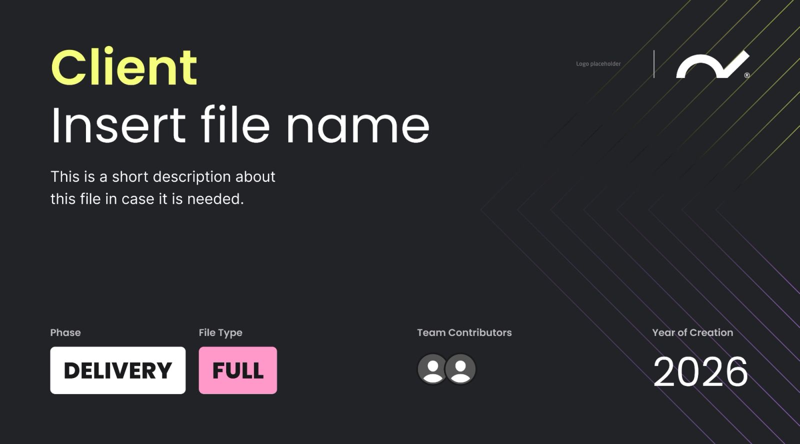
Cover template from the Rootstrap UI + Design System Boilerplate in Figma, with fields for client, file name, phase, file type, contributors and year.


